
Ecolife overview
The Ecolife app was born from a desire to find a way to track sustainability living in a friendly yet informational way. You can casually share hacks or daily finds with others,
or learn in-depth professional tips and tricks from journalists.
Role: Lead Designer
Skills: Product Design, Branding, Interactive Prototyping, User Research and Testing
Timeline: 4 months
Tools used: Figma, Illustrator, Miro
problem
Although there are many sustainability apps
out there, most lacked a welcoming and approachable experience that anyone could jump into. Few offered a blend of both community learning and lifestyle tracking in one cohesive space.
solution
Ecolife is where you balance everyday living with sustainable choices, while connecting with others who are either just starting out or already living the eco-life. You can track trips and habits to get a better sense of your impact on the planet.
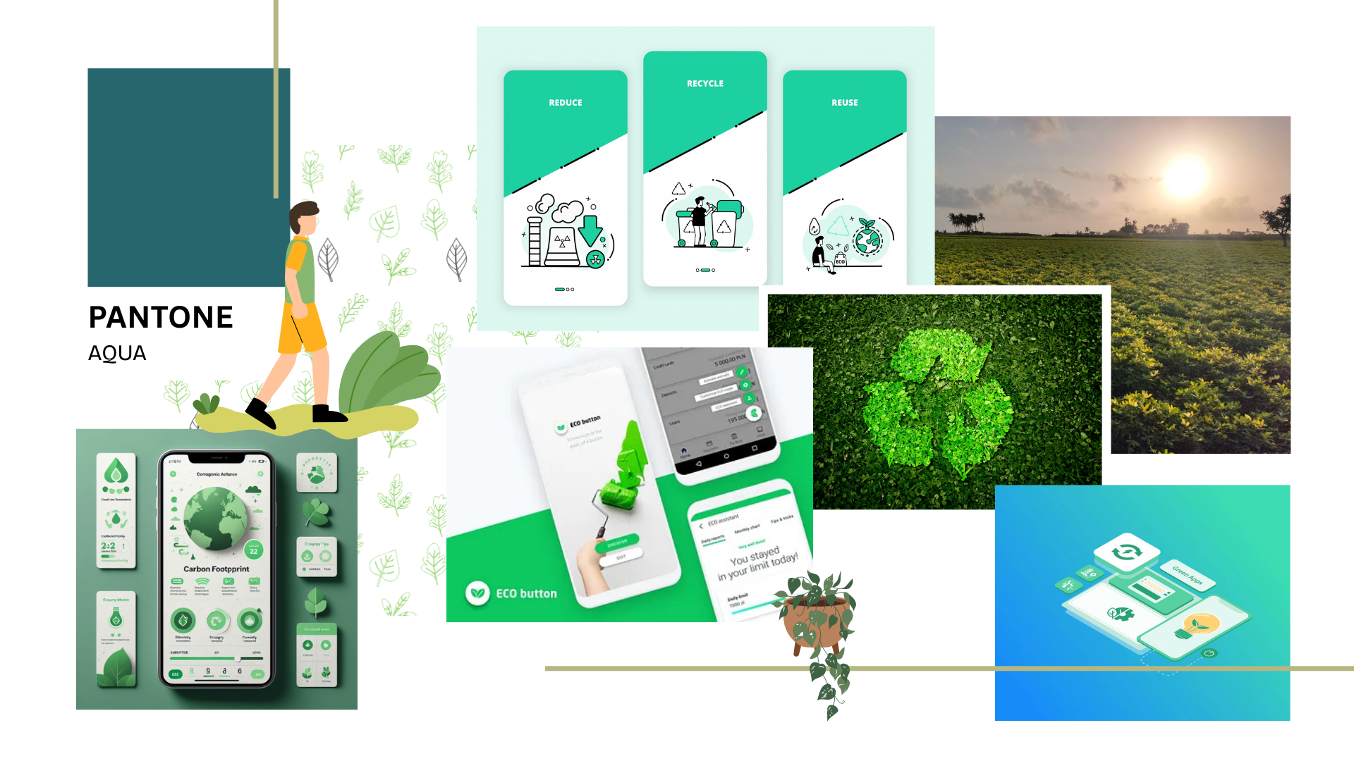
moodboard
user journey map
Emily reflected a user who wanted to make sustainability choices, thus helping me understand
eco-friendly behaviors and design features that support other users in reaching their goals.

Wireframes
During the wireframing process, I wanted to ensure that the navigation across pages was intuitive
and welcoming for all users. My early sketches involved habit tracking activities, community engagement/forums and an intuitive interface to make sure the experience wasn’t overwhelming.

introduction to ecolife features

The onboarding was made to make users feel at ease and not overwhelmed when being introduced to EcoLife’s features.
carbon footprint simplified


EcoLife turns tracked trips into simple summaries, so users can quickly see their impact on the planet without overthinking it.
Green Tips & tricks


The Tips & Tricks feature aims to inform users while making the information easy to digest and understand while still being as informative about living sustainably and the impact we have on our planet. Every day the app offers a small random memorable tip users could implement in their lifestyles.
a green community
Not only will users be able to connect themselves with like-minded individuals, but they will be able to tag and share local green businesses helping the community both socially, and economically.
Primary Logo
secondary Logo
Logo mark


prototype
After rounds of reworking and tweaking, the final design was born. Ecolife was made to empower users to take a step into living more sustainably and gaining a deeper understand of their impacts on our Earth. The result is a clean, intuitive, friendly app that anyone can use and dive into.